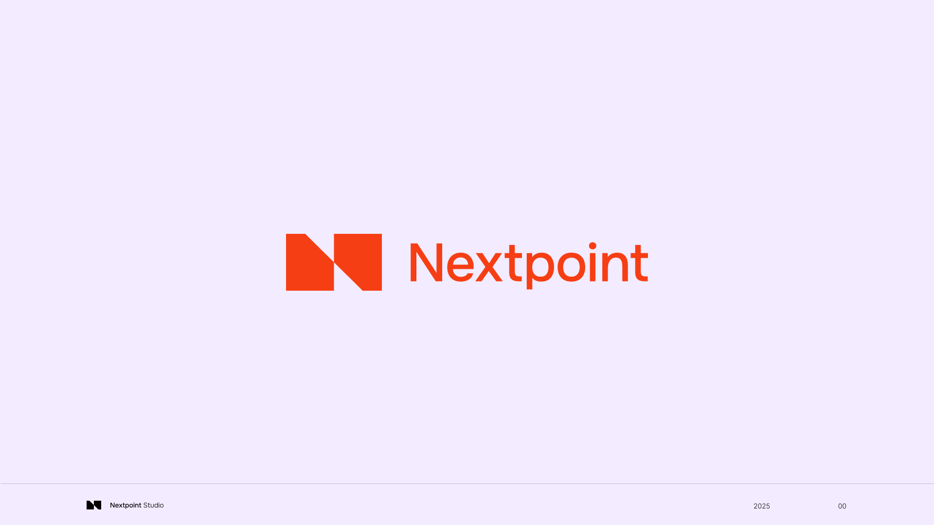
Nextpoint Rebrand
Defining a digital studio that reflects the precision and complexity of the work
1. Context
Nextpoint is a digital design studio with a strong client base and a track record of delivering complex work, particularly in HMI design for physical products and manufacturing environments. The quality of the work was not the issue. The problem was that none of it translated into a recognizable brand.
Externally, Nextpoint lacked a clear identity. There was no consistent visual language, no defined positioning, and no structured way to communicate its capabilities as a digital design partner. Internally, this made it harder for the team to align around what the company stood for and how it should present itself.
As a result, the brand did not match the level of its work. It felt generic in a space where specificity and expertise matter.
2. Problem
Nextpoint was doing highly specialized digital design work, but presenting itself in a way that made it easy to overlook. Without a clear identity, the company relied on existing relationships rather than recognition to win new business.
This created a disconnect. The team was designing thoughtful interfaces for complex physical systems, yet the brand did not reflect that level of rigor or craft. Potential clients had no quick way to understand what made Nextpoint different or why they should trust it with high-stakes, technical projects.
The issue was not visibility alone. It was clarity. Without a defined point of view, the brand could not communicate its value in a meaningful way.
3. Opportunity
There was an opportunity to position Nextpoint around what it already did well, rather than trying to broaden its appeal.
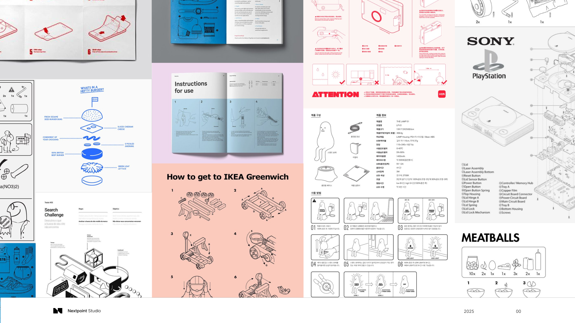
The strongest signal was its work as a digital design studio focused on HMI for physical products. This sits in a unique space between mechanical engineering and interface design, where precision, constraints, and real-world conditions shape the outcome.
By leaning into that intersection, the brand could move away from being seen as a general design partner and instead become known for a specific type of expertise. This would make it easier for the right clients to recognize its value and for the team to speak about its work with more confidence.
4. Vision
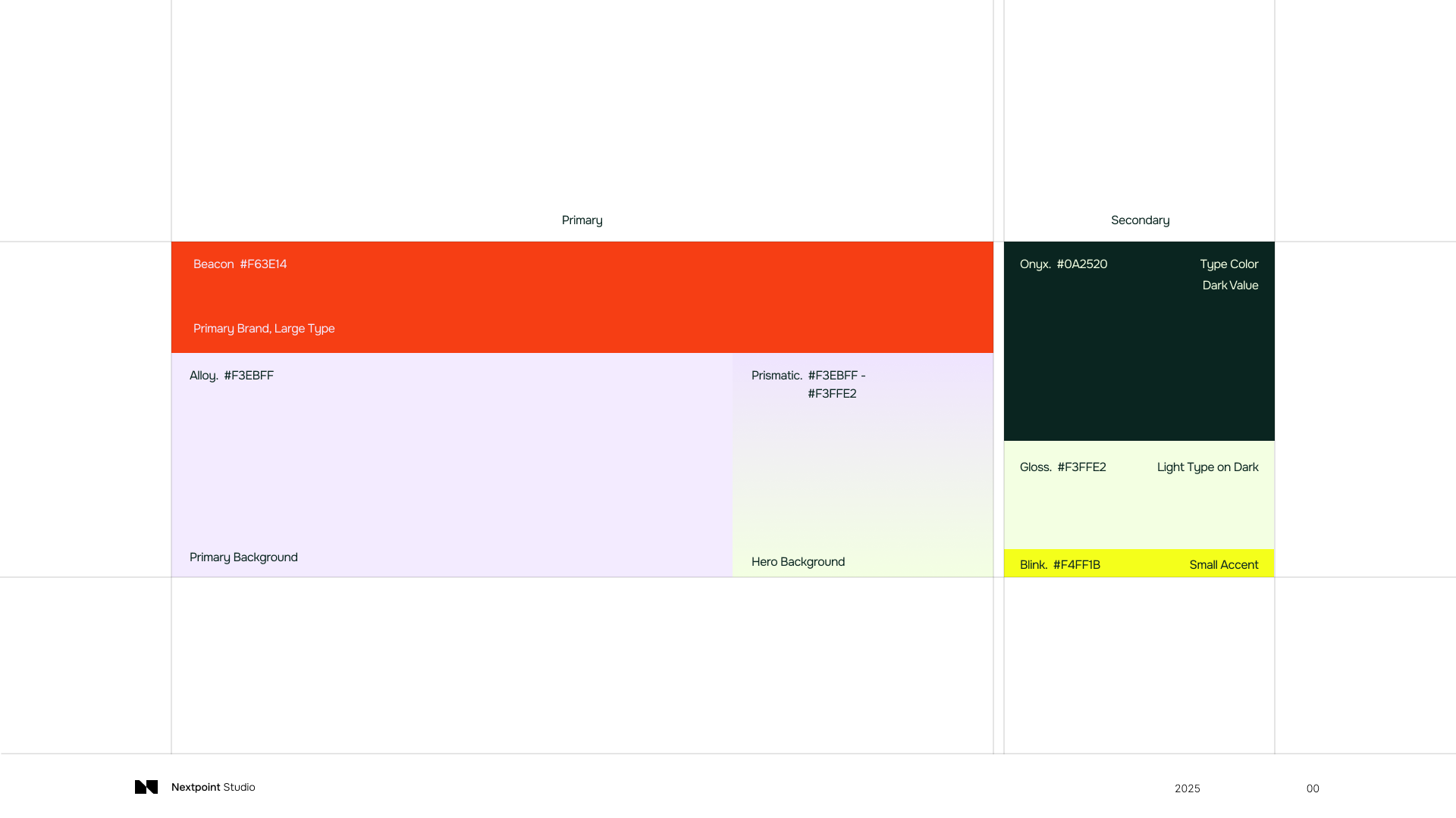
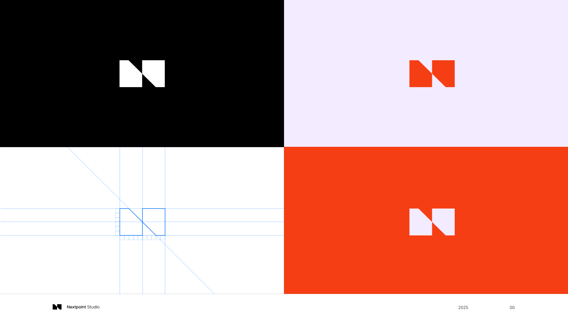
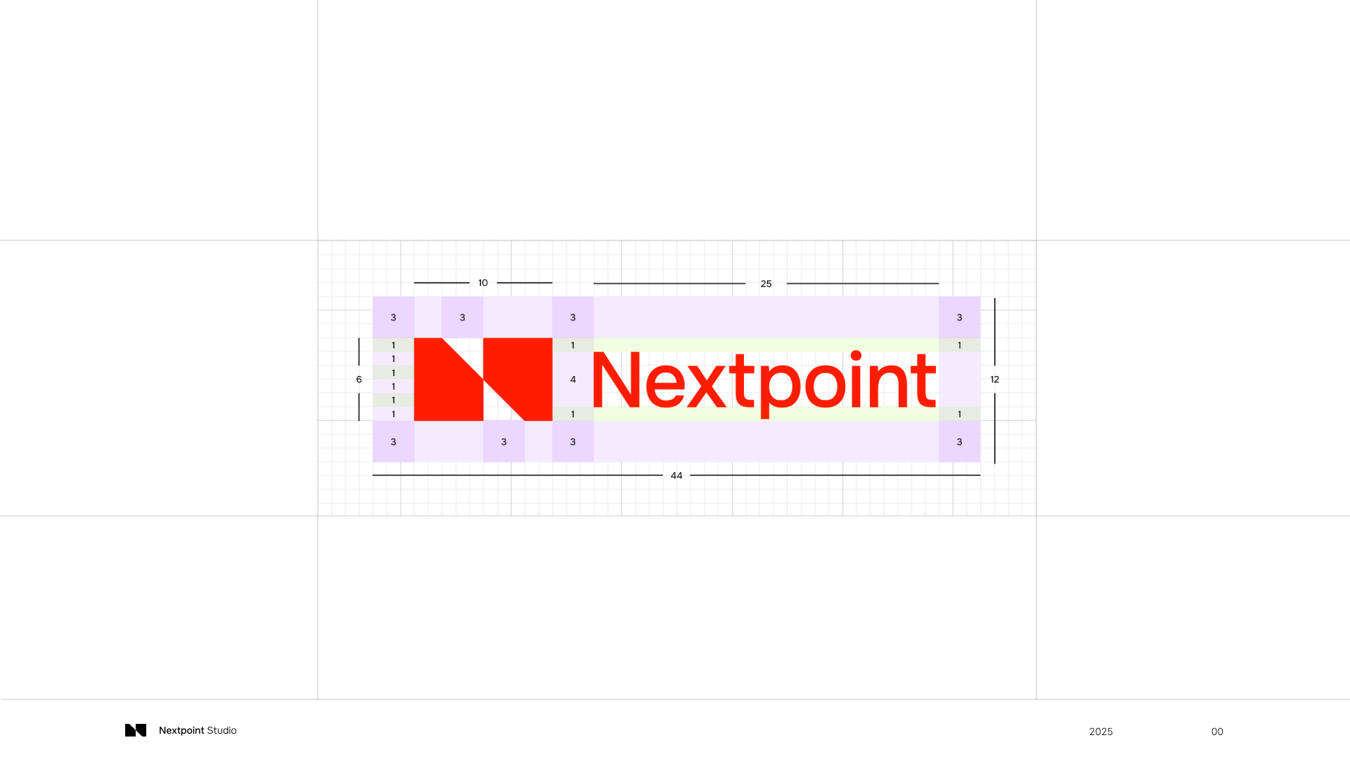
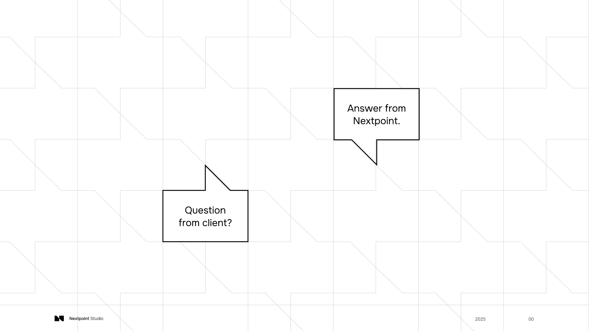
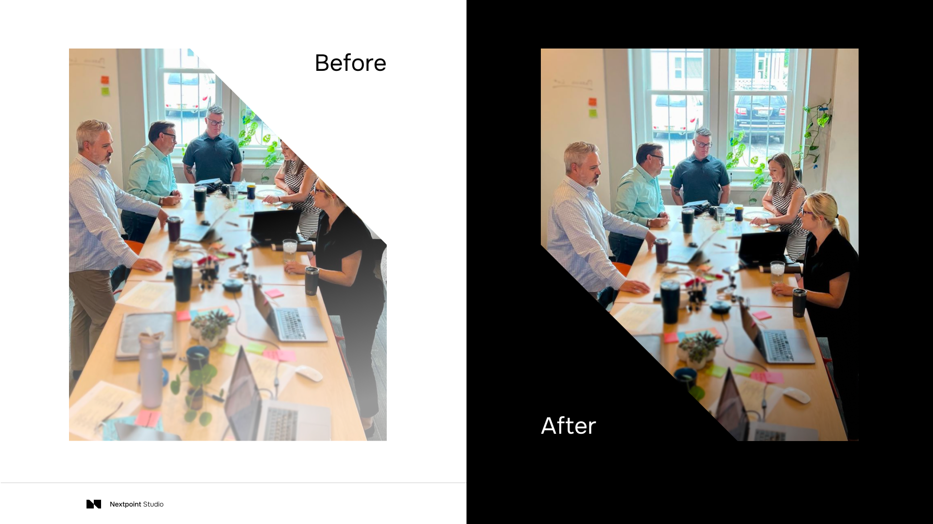
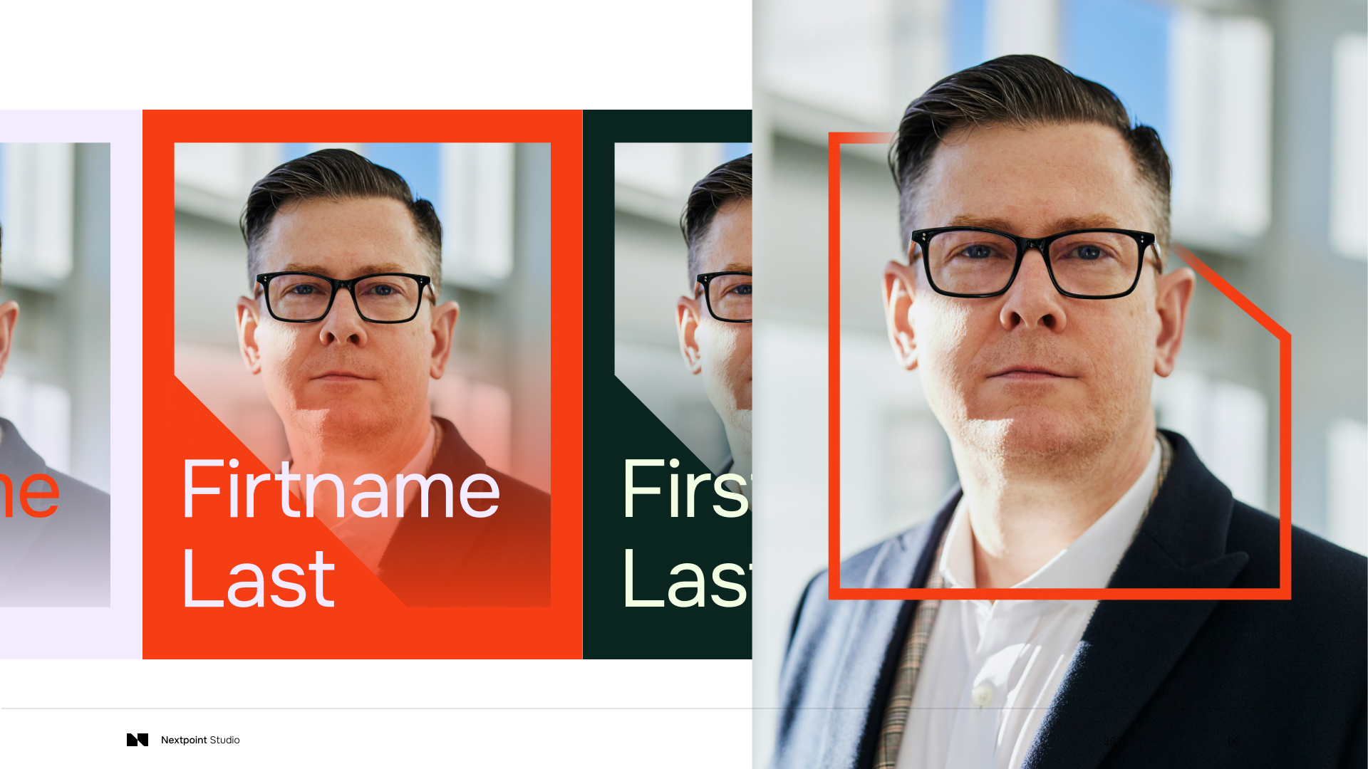
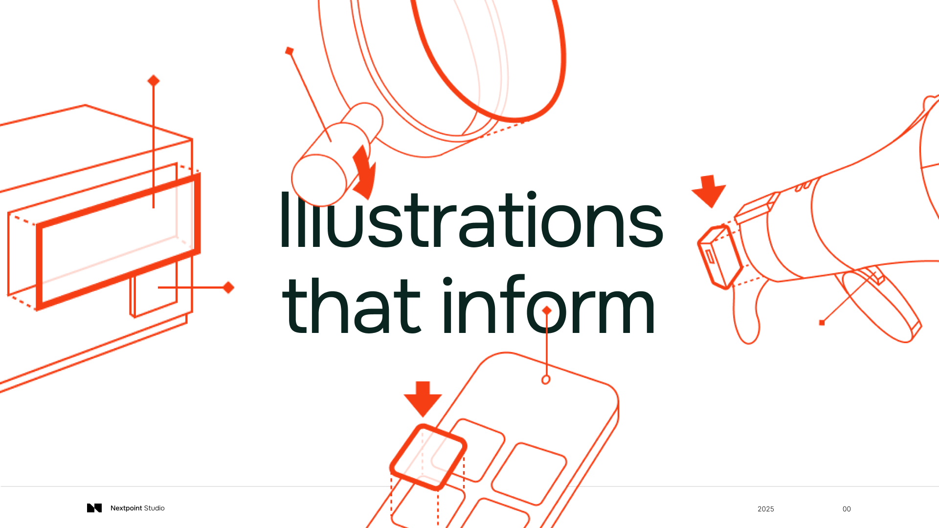
The goal was to create a brand that felt as considered and precise as the work itself. This meant defining a clear position as a digital design studio operating at the intersection of mechanical engineering and HMI, then building a visual and verbal system that reflected that balance. The identity was developed as an elevated mechanical style, drawing directly from the team’s history of working with physical products, systems, and engineered constraints.
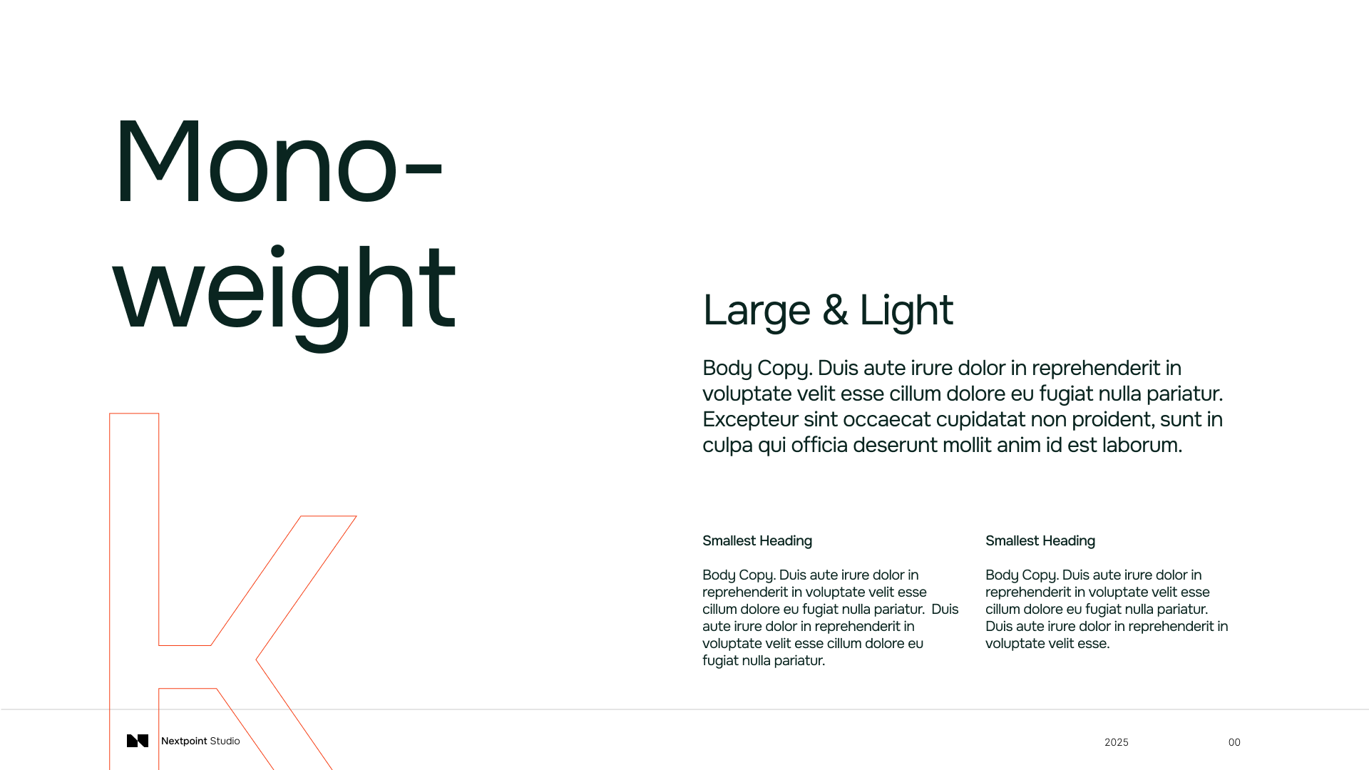
Rather than relying on expressive or decorative elements, the visual language emphasizes structure, clarity, and precision. Typography, layout, and motion reflect systems thinking, while still feeling refined and intentional. The result is a brand that feels grounded in the realities of manufacturing and hardware, but elevated to match the level of craft and design thinking behind the work.
This direction supports the broader goal of the rebrand. It gives the team a consistent way to present their work, strengthens credibility with technical clients, and makes the value of their expertise easier to understand at a glance.